Visualizations
After calculating user polarities, we went on to do the following:
- Visualize the number of shared users between any two subreddits in heatmap
- Visualize the average user polarities of the shared users between any two subreddits in another heatmap
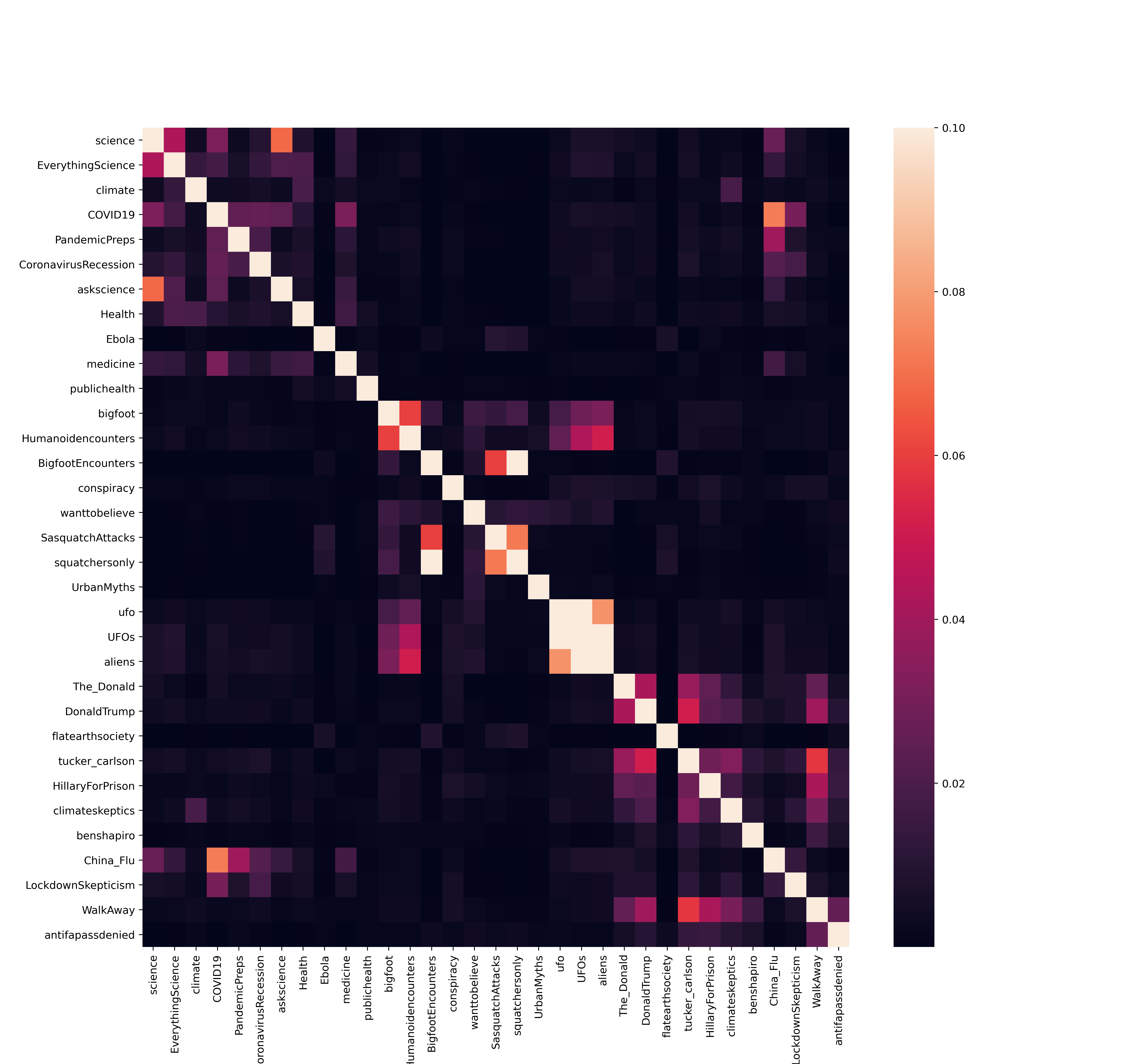
This is a heatmap showing the the percentage of common users who exist between subreddit X and Y, which is calculated using the equation:
number of shared users
total users between the subreddits
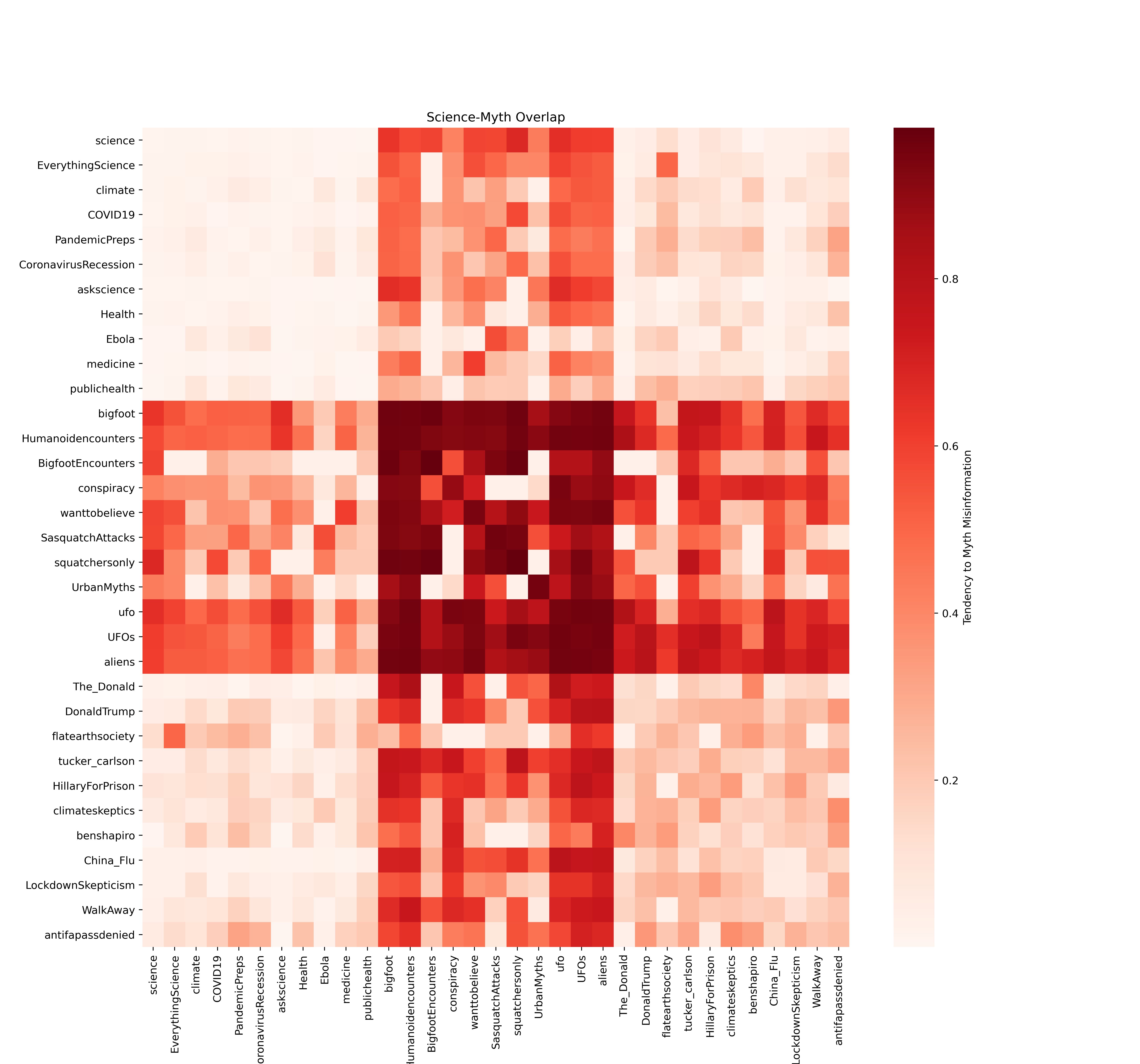
This heatmap is showing the average myth polarity of the common users between subreddit X and Y.
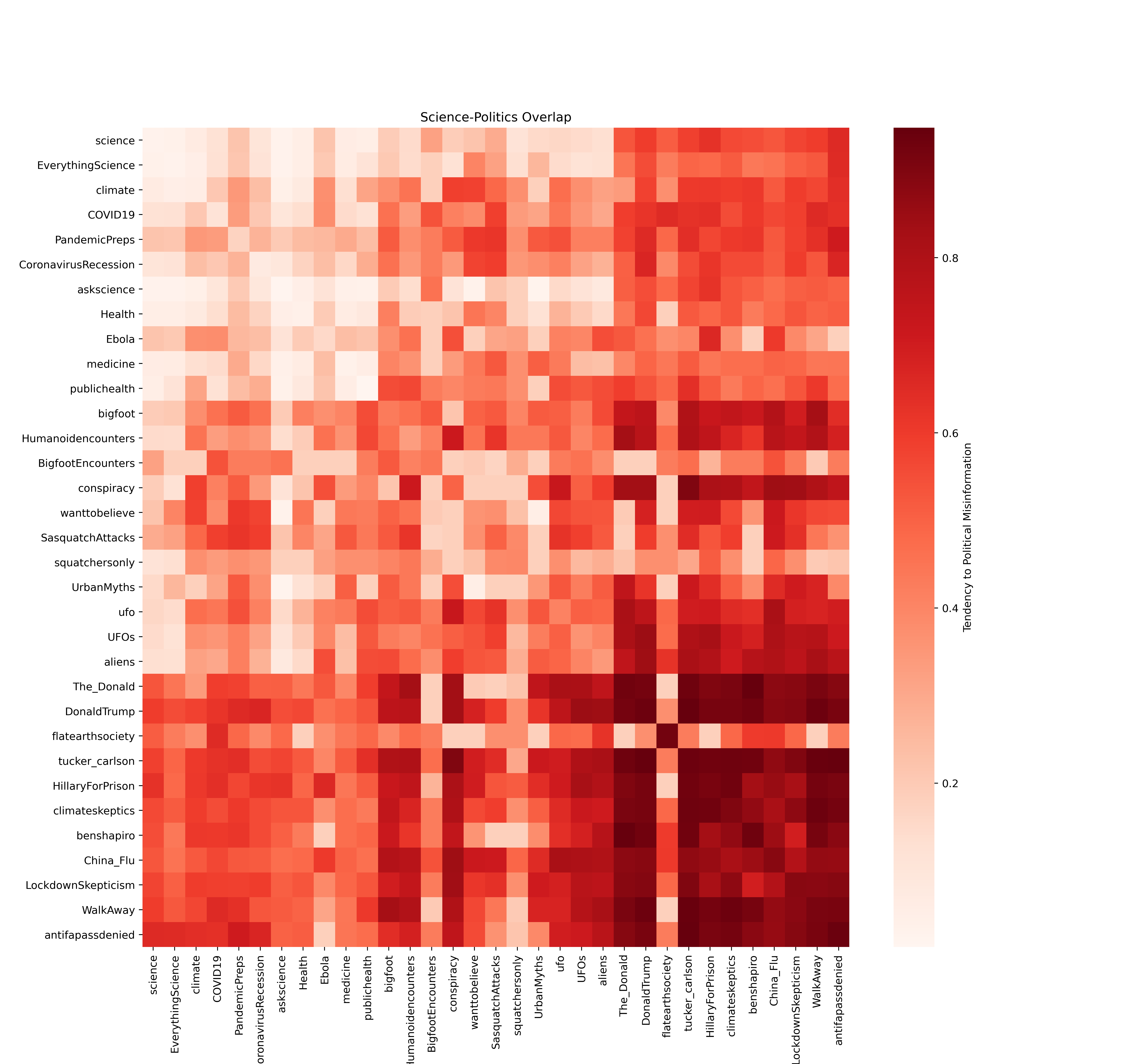
This heatmap is showing the average political misinformation polarity of the common users between subreddit X and Y.